
How the mighty has fallen. Once upon a time, Microsoft could sell garbage and people would still buy them because it was the only garbage in town. Now it’s desperately playing catch-up to iOS and Android with its late-to-the-game abysmally-named Windows Phone 7 operating system.
Naysayers are already predicting a Kin-like premature demise for WP7 and that may very well turn out to be a self-fulfilling prophecy. But for this ethereal moment, I am happy with my LG Optimus 7.
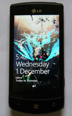
The lock screen with MIKU-02
I’ve been using the Optimus 7 for a few days now. It is a decent phone with powerful hardware and some flaws, which puts it on par with most higher end Android phones. In fact, given that all WP7 phone OEMs are also hedging their bets and making Android phones, the hardware difference between the two platform is more or less purely cosmetic, so the real competition lies in the software.
The WP7 OS is basically Microsoft’s attempt at out-Appling Apple. For every difference in philosophy between the iOS and Android, Microsoft went with iOS. This makes the end product anathema to my usual preference for customizability, but I can see its merits.
Interface
Microsoft chose to adopt Zune’s UI directions when designing WP7, completely abandoning its Windows roots. This is a good thing because Windows Mobile is and will always be the ugliest smartphone OS ever created.
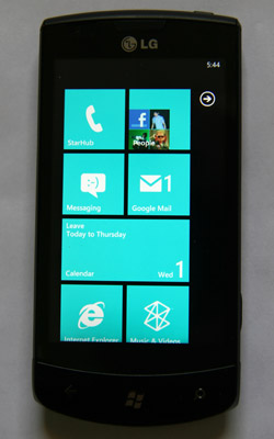
The home screen with Live Tiles
The unified UI design (Microsoft calls it Metro as it resembles subway signs) is very much in line with my personal sense of aesthetics — san serif, flat and minimalist. I never liked the 3D chrome and shininess that both Android and iOS employ in their icons and UI. Some people would see it as lazy design (*cough* like this blog *cough*), but I just find the flat display visually appealing.
The UI elements are all very smooth and responsive and in terms of human interface there is nothing that really differentiates the WP7, for better or worse, from the iPhone. You have all your standard swipes and pinches.
The OS interface taken from Zune media players is fantastic. Combining real-time information and application icons into so-called Live Tiles offers no real practical advantage but does stylize the home screen a great deal. The flip side of this is that for all purpose and intent the home screen is not customizable beyond rearrangement of the Live Tiles.
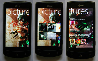
The Pictures hub
Microsoft calls its app-design concept Hubs, but that moniker makes zero sense to me. What they mean is that what would normally be different screens within an app on Android or iOS are combined into one giant side-scrolling screen. You swipe horizontally to see different aspects of the application. For example, in the Music and Videos app, you swipe rightwards to see play history, recent additions, etc. This implementation reduces the number of on-screen UI elements needed to navigate the applications, which is great, but some people may be annoyed by the way the screen crops.
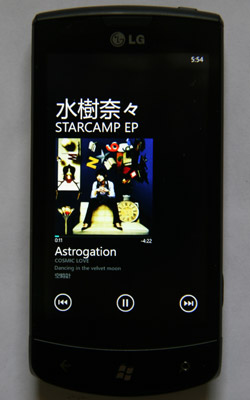
Album art, navigation buttons and white san-serif text on black background are all I need
Oh and I really love the media player interface. It’s an exact representation of my ideal interface. Indeed, I would be all over the desktop Zune player, which uses the same design motif, if it wasn’t missing so many features like global hotkeys or minimizing to tray.
Hardware
Taking a page out of Apple’s world domination guide, Microsoft has set very specific guidelines for WP7 hardware. The end result is that all the launch phones look like clones of one another. They are all extremely boring in their perfection.
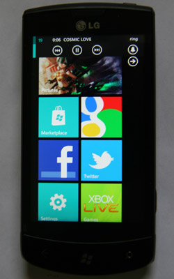
Some app tiles; also media control at the top
For example, all WP7 phones (Windows Phone 7 phones? Please shoot the marketer who came up with the name) come with three physical buttons below the screen: Back, Home and Search.
By default Search launches a hidden Bing app but this behaviour can be overridden by the active application with an app-specific search. For every new app you use, there is no way to know what the Search button will do when you press it until you give it a try. It’s like Heisenberg’s cat except that instead of death you are forced to use Bing half the time. There is no way to change the Search to launch Google instead, making this particular compulsory hardware button completely dead to me.
The Home button works like it should. You can hold it down to activate voice commands. The only thing I don’t like about it is that, unlike the iPhone, you cannot use it to wake up the phone. You have to press the Power button to unlock your screen. Again, there is zero options to modify this default behaviour.
The Back button not only goes “out” of a screen/app like in Symbian phones, it literally goes back like in a browser. For example, you can press it in the Home screen and end up at the previous app screen that you just closed. This can be useful or annoying depending on who you are, but I think it’s useful.
The 480 x 800 capacitive touchscreen is really nice, but then it’s standard by now. The Optimus 7 has a TFT screen but some of the other launch phones have AMOLED. There are some slightly dark spots at the bottom of the LCD similar to the PSP screens, but they are not noticeable in normal use. Personally, I think it’s good enough.
The battery life is like 5 minutes or something. But apparently it’s still rated as one of the longer ones in today’s smartphone world. Certainly, I don’t think it is shorter than most Android phones, so it’s more of a limitation of physics than anything.
Some hardware gripes specific to the Optimus 7: the power button is awfully small for a button you have to press all the time to unlock your phone, the volume rockers feel terrible to press on because they are small and hard and the USB cover feels flimsy as they all do.
I’ve also had problems with applications opening up in landscape mode (the main UI has no landscape mode) even when I hold the phone upright. I am not sure if this is specific to the Optimus 7’s accelerometer implementation, or if there is something wrong with WP7’s software algorithms. It’s a minor problem that can be easily solved with an orientation lock. Hilariously, Apple unsolved this problem for the iPad in the latest update.
Software
This is where you can tell that Microsoft really rushed this puppy out of the door.
Most default applications come with close to no customization. For example, Internet Explorer has a total of three options plus delete history and there is no way to change the home page. (Arguably you don’t have to since you can just create a shortcut for it but that’s a dumb argument.) Now it works fine, scrolls well and is generally bug-free, but it’s no Opera Mobile.
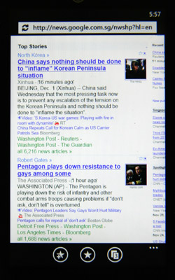
Internet Explorer
Functionalities like YouTube and World Clock were added in through official Microsoft apps in the Marketplace probably because they failed to meet the deadline for the production ROM.
The official YouTube app is just a browser window with YouTube’s mobile version, but you must install it to play YouTube videos because it comes with some critical backend that should’ve been native to the phone, given that the vanilla OS already plays H264 videos out of the box.
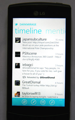
Official Twitter app
There are supposedly thousands of applications on the Marketplace, but most of them cost money so I am too cheap to try them. The free Facebook and Twitter apps are decent if slightly lacking.
On another note, Bing Maps sucks monkey balls especially when it comes to location search. The WP7 app doesn’t even have turn-by-turn directions. I often find myself using the horrible web-based Google Maps (or gothere.sg which uses Google API). I can only hope that Google finds the time and incentive to make a WP7 Google Maps app.
My favourite part of the WP7 software is the People app/hub (i.e. the contact list). The phone can synchronize all your Windows Live, Google and Facebook contacts and create consolidated information of every person. It does so by matching email address across accounts, but you can also manually tell it to link contacts that it cannot automatically match. The end result is that I can easily see the Messenger accounts, Facebook statuses, email addresses and phone numbers of people in one single interface and use their Facebook display pictures for Caller ID.
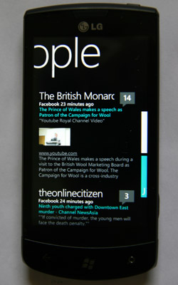
Facebook status updates in the People hub
The drawback to this implementation is that the master list defaults to your Windows Live contact list. There is a setting to hide Facebook contacts who are not linked to anyone in your master list, but you can’t do the same for Live because it is the master list. And of course there is no way to change the default option.
So if you have a habit of adding random strangers on your Messenger account, you will have a lot of unrecognizable email addresses in your contact list. Fortunately, this is more of a matter of aesthetics than usability since there is instant search. Bizarrely, there is a software button for instant search in the People Hub, rendering the dedicated hardware button moot in this case.
Zune
What is even more bizarre is that Microsoft decided not to implement Outlook contact sync. In the past, this was done with ActiveSync (brings back memories of my old HP iPAQ), but that ancient relic has now been replaced by the Zune software suite, which, being a media-centric software, provides zero contact management functionality. Ironically, this makes iTunes superior because it does sync local Outlook contacts.
Of course, this problem is specific to contacts stored locally. There is no issue when syncing with contacts stored on Outlook Exchange servers because you can simply add the Exchange account like any Gmail or Live accounts.
Amusingly, the easiest solution to this problem is probably to export all your local Outlook contacts into Gmail using a CSV file and then syncing with your Gmail contacts.
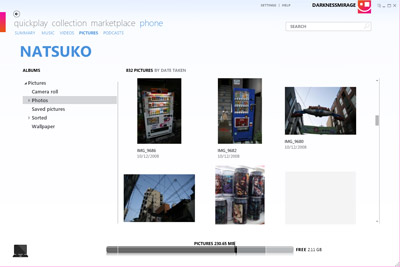
Managing photos on the phone in Zune
But in general the Zune desktop software is pretty sweet. It feels more lightweight than iTunes on Windows, no doubt because it uses native Windows APIs and does not need redundant memory hogs like Bonjour or Apple Software Updater. It even plays Xvid AVI files, auto-converting them to H264 when syncing with WP7, but unfortunately it does not recognize MKV containers.
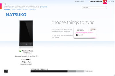
Zune sync
Zune also does all the iTunes stuff like Marketplace, photo album management, song ripping and transcoding and region-locking you out of Marketplace if you live in the wrong country… God bless Microsoft.
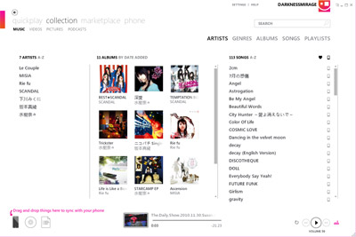
Zune album management
Of course Zune comes nowhere close to replacing what I use Winamp for, but I actually find it orders of magnitudes more usable than the horrible spawn of Satan that is iTunes for Windows.
Facebook v. Google
The level of Facebook integration in WP7 is actually quite amazing. For Microsoft, this may be a strength worthy of further leveraging.
You can find both the individual Facebook status updates of your contacts and a general feed in the People hub. There is even a built-in interface to read and write comments.
Facebook is also the only other built-in upload option for photos taken with a WP7 phone, with SkyDrive, Microsoft’s cloud offering for photo sharing, being the other option. Picasa Web Albums is nowhere in sight.
In the Pictures hub, both your Facebook and SkyDrive albums are listed alongside your local albums/folders. You can also find a feed of Facebook albums uploaded by all your friends and comment on them from within the native UI.
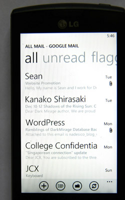
Gmail: the only Google product that WP7 grudgingly mentions
Plus the fact that the stupid hardware search button is hard-coded to Bing, it appears that Microsoft and Facebook are really getting in bed together to form a united front against Google. I can see WW4 in the making (after we emerge from our nuclear bunkers in the aftermath of a second Korean War).
Overall
It looks like I have more complaints than praises because finding faults is what I am good at. The truth is that for all its lack of multi-tasking and copy-pasting, WP7 is not any worse an OS than iPhone’s first iteration. In fact, I much appreciate the general design and UI innovation that WP7 brings to the table. I find the minimalist navigation more to my liking than iOS or Android and that is the main reason why I have a generally positive final impression of the WP7 OS.
That said, the road ahead for Microsoft is long and treacherous and it faces a Sisyphean task ahead. There is much taint associated with the Microsoft and Windows Mobile brand names, and being as good as the competition is not good enough to overcome that. Given that it is already late to the game, it may never get the momentum it needs to redeem itself.
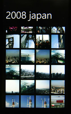
Adjustable thumbnail size would be nice given the tiny default
The Metro UI design is highly subjective in its merits and works for me, but in terms of pure technical advantage the WP7 has nothing. In fact, it is functionally inferior to the iOS at this stage even if you do not take jailbreaking into account, much less the open Android platform.
Microsoft needs to first fix all the things that are wrong with the OS (crappy calendar, copy and paste, lack of settings, locked to Bing for most dedicated functions), which it may or may not manage to do with the rumoured massive patch that is coming.
Then, even more importantly, it needs to bring something new beyond aesthetics. Perhaps something to do with the existing Xbox Live integration. After all, the 360 seems to be the only bright spot on Microsoft’s resume these days.
I’m selling away my Optimus 7 when I leave Singapore next year so I’m only intending to experiment with WP7 for a short while. Despite how much I adore its UI, my conclusion for now is that Android will probably be more suitable for me in the long term because I need things like tethering and USB mass storage support (which even a jailbroken iPhone can do)…
But perhaps Microsoft will make me change my mind with updates in the next few months. Do you believe in miracles?
If only there were some way to get the best of both worlds.
P.S. I would totally love a Windows desktop OS that uses the Metro design.

1. Your point about Zune UI on desktop is well taken. Some tablet maker should really jump on that. As for skinning windows, you can probably already do it (to give it the metro look).
2. The first iteration of the very late comer being better than the first iteration of the very first-to-market (or second or third, but you get what I’m saying) is simply not good enough. I mean they’ve had the Zune for a while now, it arguably gives MS zero excuse to hit a home run right off the bat, besides production scheduling woes. Also, I’m not sure you’ve tried the WebOS stuff, it’s a good point of comparison.
Plus all that crackle internal to MS about cloud computing, it would be shocking if they didn’t already had a mobile OS strategy 5-10 years ago, that WP7 is some rush job they put together in the past 2 years is hard to believe…but it looks like that’s what it is!
3. Google maps on WP7 is at the mercy of MS, since they do have a competing service. Same with google search app. Well, we’ll see how that one plays out.
4. Do you have a xbox?
When I saw Windows Phone 7 on your feed, I knew I had to read this…
If you’re learning Japanese, please check out the NihongoUp app ;) And if you like it pls rate & review it ^^
omo:
No, I don’t have an Xbox. I just think that Xbox Live integration can be huge if they get some proper first-party games going. The hardware specs are good enough for graphic intensive gaming.
An official Google search app already exists (you can see it in one of my screenshots), along with a few unofficial ones. The main problem is that you cannot remap the hardware search button.
Even though WP7 UI is innovative, I still think it’s a flop because of the lack of multitasking and copy and paste. My Samsung Blackjack from 2008 could do multitasking, custom ringtones, copy/paste and slide load applications… and it ran Windows Mobile 6.0… There is no excuse why Microsoft didn’t add these features if the had them in Windows Mobile…
The problem is, Windows Phone 7 lacks many of the features of Blackberry, iPhone and Android. On top of that, they are still using the crappy Internet Explorer 8 rendering engine instead of the more standards compliant engine in IE 9… Therefore, I think WP7 is just as crappy as Windows Mobile 6 I used in the past not because it’s clunky, it’s not competitive. This is probably a reason why I ditched my Windows Mobile 6 Samsung Smartphone for a iPhone 3GS, because Microsoft is horrible at mobile OSes… Windows Phone 7 will never beat Blackberry, Android and iPhone… They are too late to gain the lost customers from Windows Mobile.
I’ve got one of the HTC offerings in addition to an iPhone, and honestly I don’t think WP7 is ready yet, at least not for me. Mainly the issues I have are lack of app support. It also really annoys me that the phone doesn’t have an IME or anything. One of the best things about the iPhone is being able to enable a Japanese keyboard. When you’re learning the language, being able to actually type it in is fairly important. My options for input languages in WP7 seem to be UK English or UK English. :\ Also as you noted, Bing maps utterly sucks. I also see the whole interface getting fairly clunky in the future unless they add the ability to group apps together under a single hub on the home screen. Having to scroll through that list of everything is fine when you’ve got ~30 options, but the more you use the phone the more clunky that’s going to feel.
I also had a fairly sour initial setup experience too. I crashed the phone three times, and ended up having to factory reset it twice. The first hotmail account you sync to it becomes your primary account, and it *cannot be removed* from the phone. It forces syncing of contacts, calendar etc from there, and you can’t turn that off. My hotmail account was something I first set up over a decade ago, and I haven’t used it since I moved to gmail not long after gmail was first set up by google. My Xbox Live account is linked to that Hotmail account, and that’s the only thing I use it for. It’s full of contacts from people that I used to talk to a decade ago. But I attached it to the phone so I could grab the Xbox Live stuff. Trouble is that my contacts list was then polluted with all that junk and no way to remove it. Reset the phone, made a new hotmail account so no shitty contacts, but that meant that I ended up unable to use the Xbox integration, so I had to go into my old hotmail account and go through 200+ contacts to cut all the ones I didn’t need, which was most of them, then factory reset the phone *again* to go back to the original account. Stupidly broken.
In the end I’ve pretty much shelved my WP7. It doesn’t offer me anything that I don’t already have. If I wasn’t an existing smartphone owner I’d probably stick with it.
If I remember correctly, the iPhone did not get IME support until the 3G version was released in Japan. Given that Microsoft probably started making all this like 6 months after the iPhone came out and rushed it out of the door, I can see why they did not bother with IME.
I agree that there are a lot of long-term problems that Microsoft needs to solve with software updates, such as a lack of SMS drafts. Hopefully WP7 doesn’t die before that happens.
I think it’s way too early to make a call on WP7 for any sort of definitive measure. But when you compare it to Android, it really falls short… Well, 1 year after Android’s first phone they’ve already got most of the basics covered, so the 1 year mark for WP7 would be a good place to compare.
I’m doing this comment thing in necro manner to drop a link for you, if you haven’t already found it:
http://lifehacker.com/5504465/how-to-transform-your-windows-desktop-with-an-amazing-windows-phone-7+style-hud
I’m Korean…T_T
After several years of using an old HTC Windows CE phone, I saw the LG Optimus Quantum and thought it was time to upgrade. Phone looks great. Ugg… I couldn’t have imagined the nightmare.
The first thing was getting my contacts, appointments, etc. over. No problem, just use ActiveSync. When my old phone died and I got a replacement it took me 5 minutes to re-enter my email settings and then just re-sync with Outlook. Humm… Windows Phone 7 doesn’t support ActiveSync except with Exchange. Humm…
The only option was to export and import (contacts only) to a Windows Live Hotmail account. Only Windows Live won’t sent me confirmation emails. I *hate* any system which required a third-party web-site in order to get a consumer electronics device to work. Even if MS support fixes this, it will only import my contacts. The thought of manually copying/updating my Xmas to-do list and calendar appointments is something I just can’t f-ing imagine. Might as well take my old phone with me to the store.
The second problem was I wanted to get hold of the manual from LG. The little user guide sucks, so I figured they would have a move complete manual on their web-site. I went there only to find you need to download some program to get the updates and manual. Humm… And of course the program wouldn’t work. It won’t accept serial numbers, IMEI numbers, or get them from the phone. It keeps barking about drivers. When I tried using it to update the driver… it wouldn’t list the Quantum Optimus model – even though I downloaded it under the Quantum Optimus. The idea that I need to use a program to connect to my phone in order to download a manual to provide support for my phone is equally stupid.
Issue number 3, I can’t view YouTube videos without some program installed. And it won’t install programs without a Windows Live account.
Issue number 4, Zune. Why do I need another music player organizer on my computer. Why can’t I just copy the files to the phone or use Media Player to sync the files? Media Player can sync with my $59 MP3 player? The idea of having another Microsoft application to manage my music (on my Media Center PC none-the-less) is just mind-blowing.
I got the Blackberry Torch, it has been pretty good so far.
A Blue Screen Of Death on the instrument panel of your car while you’re going down the highway at 60+ mph will likely have much greater consequences than having to press CRTL-ALT-DEL.
Hello, its fastidious post on the topic of media print, we all be familiar with media is a impressive source of data.