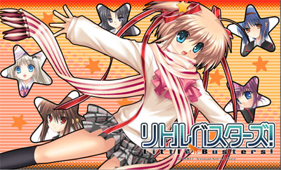
Studio Key‘s (makers of Air, Clannad and Kanon) latest project, Little Busters!, has finally been given an official release date. You can look forward to downloading buying it on 27 July. And the Key fanboys go wild!
Actually, I’m getting sick of Key games. Not to mention that Itaru Hinoue‘s art isn’t looking any better. The style has changed and improved, but it still can’t compare to the high quality art that I am used to seeing from the other (relatively) major game studios. I mean, what the heck is this thing? Seriously!
Tomoyo After had the best character art ever in a Key game. Planetarian comes in second. Guess who did NOT do the character designs for them? <_<


hiaz…..eroges….one of the things i will never understand…
I really like Fumio’s art for TomoAfu, really hawt, but Tomo-chan’s WTF face sticks long in memory, sadly.
…*looks at the newest project* wth, is Key going down faster than light down a straight black hole? But, knowing me, if the music’s gonna be done by someone I like then…
Yeah, I don’t really like the artwork of Key’s games in comparison to others but it’s still pretty good in my opinion… Looking forward to this new game XD
Time to get Windows Vista and boot up all the games with nice Aero effect. :)
http://kotaku.com/gaming/top/vista-does-dirty-japanese-game-display-232329.php
Seeing how Kanon and Air looked, with their humongus chins and all, I can honestly say this is a pretty significant improvement
With the kids sing out the future
Maybe, kids don’t need the masters
Just waiting for the little Busters (oh yeah…)
Wai~ Already stuck it in all my signatures and set it as my wallpaper.
Can’t wait :P
DarkMirage, look at the bright side: they don’t look like extraterrestrials anymore!
For a minute I thought this post was either going to be about FLCL or The Pillows.
I kind of like the style, actually.
Anyway, art should be like that. Better to make something some people love, than all people merely like… ne? :)
A lot of anime/manga/eroge art is too generic. Excellent technical execution, but where is the spirit? I like it, and can love the characters, but I tend to see wasted potential in a game when it comes to the art a lot of the time.
It’s as if they all see into this alternate reality, and are going for photo realism with respect to it.
Of course, this is because they need to keep it generic to sell to the widest audience. But at some point it stops being ‘art’ that you can appreciate by itself.
I do wish people would be a little more open to something different once in a while. Key art only just barely strays from the norm anyway…
>>Guess who did NOT do the character designs for them?
I meant to say: I kinda miss her …
FUCK YESSSSSSSSSSSSSSSS.
Time to really put in an effort to completing CLANNAD. lol
I’m not even paying attention to the faces. Rather, I hate the uniforms to a possibly unhealthy degree. Those skirts…! It’s not good fanservice, it’s a freaking fashion disaster. JESUS.
*puts caps lock away*
>>Guess who did NOT do the character designs for them?
seems I’m having the same problem as DF… I definitely typed something after that. anyway:
guess which Key games were the biggest hits?
Eh? A new eroge?
…
…
…
I’m blank as usual…
Well, at least the chins are proportional this time.
Might as well check this out. >:3
Well, the chins are definitely something of an acquired taste, but the art is definitely better-looking, as far as I’m concerned.
Those 2 games you listed at the bottom I saw them before I was like “whoa Key made this? why dont they all have huge chins?” lmao. the art style has improved if you compare it to like Kanon and ONE but yea those 2 at the bottom are 10x better :P
I really need to edit WordPress to fix the > problem someday.
LOL!! Looks like an ultimate rip off of sol badguy minus the kick-assness
You think Tomoyo After has the best Key art?
What the fuck is wrong with young people nowadays.
http://www.listeninginthedark.blogspot.com/